Simple

Simple

Merry Christmas

Painting by Constant Montald
Merry Christmas and thank you for your good wishes.
 
~ D ~

I'm Getting Married!

 I'm usually reserved and don't share much about myself here, but I wanted to share the happy news that Jon and I are getting married.   This is the happiest time in my life and I feel so fortunate to be marrying such a wonderful man.  I never thought during many years (actually many, many, many years) of being single that I would meet a man that is as good, kind and thoughtful as Jon is. 
 
We've been dating for six years, became engaged over Thanksgiving and have decided to marry this New Year's Eve.  The response from everyone has been "this New Year's Eve?", but we are eager and excited to start our life together and what better way to end the year and start the new one than with a wedding.  We are not having a wedding per se, but instead a small private ceremony.  As much as I enjoy weddings, the thought of planning one right now is daunting. 

Jon is selling his condominium and we will live in my small house until we figure out our next move.  This will mean blending his furniture with mine, choosing new furnishings together and making the most of the limited closet space in my house.  We're converting an unused room into a home office and I already have a dramatic paint color in mind for the room.  We have a few other home improvements we're planning  and it will be fun to share these on the blog. 
 
We've both been cleaning out clutter from our homes to get ready for the move so although the Christmas tree is decorated, I've not done much holiday decorating.  I've been inspired by great ideas from other blogs, however, so hopefully I'll find time to do more Christmas decorating. 
 
I wish you all the best for the holiday season.  Thank you for reading my blog throughout the year-- I greatly appreciate the time you take from your busy life to read, follow along and leave such kind comments.  It means so much to me.
 
All the best to you and your families,
Deborah
 

UPDATE: New Source For Paper Lanterns!


As a follow-up to my last post, if you are interested in buying the paper lanterns by Architectural Watercolors,  I found them online at Sue Fisher King in three styles (link attached). 

Enjoy!

Table Lanterns For The Holidays

Gregory Van Boven Interiors - Traditional Home Magazine (here)

 
Aren't these paper lanterns charming?  I remember seeing them in Traditional Home magazine a few years ago and wondering where I could buy them.  Unfortunately, I couldn't find them anywhere.  I was thrilled this week to read about the lanterns at "Noted", the blog by the artists of Architectural Watercolors (see blog roll) and the creator of the lantern images.  Noted posted that the lanterns are being produced again through Libretto Group.  Thank you, AW.  You've made my day.
 
I searched Google and found the paper lanterns (pictured above) at Careful Peach Boutique.  However, I ordered two of the "Mr. Jefferson's Folly" lamp (below) and can't for for them to arrive. I plan to buy a few battery operated tea lights to pop inside a lantern and let it glow, let it glow, let it glow (sorry, I couldn't resist).


 UPDATE: The lanterns may no longer be available at Careful Peach boutique.  I'm trying to find another source and if I do, I'll post it here.
 
Happy Thanksgiving

Warm and Cool

Country Home Magazine, February 2006.  Photo source here.
 
I have been culling my collection of magazines and found an old issue of Country Home, which was my favorite magazine along with Cottage Living.  It's a shame that both magazines are no longer published (along with a few other casualties of the 2008 economic downturn).
 
Anyway, this photo is not from the sole Country Home magazine in my collection, but I remember the feature well.  The contrast between the toast colored furniture and cool blue-green walls (painted Restoration Hardware's Silver Sage--remember that paint color?) made quite an impression on me.  The black accents work well too along with the shine from the mercury glass lamp.  Why isn't someone reproducing lamps like this today?  They are impossible to find.
 
I have the itch to buy this paint and get busy, but the open floor plan of my house means that the entire downstairs would have to be painted this color, which probably wouldn't work well long-term.  At least I can admire it from afar.


Pretty Powder Room


A room that includes both antique and contemporary pieces always gets my attention.  Add neutral colors, texture and a bit of sparkle and I'm sold. 
 
Wishing you a beautiful fall day


Belgian Influence


Australian designer Susan Sheller's Belgian style home here.  Photo by Simon Kenny

I've always wanted to do a post about Belgian decor, but it's been four years since I started the blog and Belgian style has become even more popular.  As a result, there are those who highlight the style better than I ever could (like Greet Lefevere at Belgian Pearls).  I only posted this room to show the beauty in simplicity, which in my opinion, is the heart of Belgian style. 

Keeping It Simple (in Provence, no less)

Source
A search on google for something else entirely led me to the website of a hotel in Provence (worse things could happen, I suppose, when it comes to the Internet). I must have let out an audible sigh when I saw this room at the Benvengudo Hotel in Les Baux de Provence. Don't you feel more relaxed just looking at the photo? The soft colors and gauzy drapes are so inviting.   The wood paneled doors make the room--it could be bland without the additional color and texture.
 
 
The flat screen television doesn't jive with my idea of a week in Provence, but it is a hotel room after all.  Some U.S. vacationers, for example, may want to keep up with events at home, like what's happening with the debt ceiling.  Not me.  I'd pass on watching television although I can't go more than two hours without checking email on my iPhone so who am I to judge?

 
After you've caught up with what's happening in the world (if you must), you could head downstairs for a relaxing and probably delicious dinner in the hotel dining room.

 
I had a cozy table for two in mind with Jon, but this would work too.
 
 
Isn't this a beautifully simple table setting and flower arrangement?  It appears as though each table has its own box of Fleur de Sel.  I just love French sea salt (yes - easily impressed and gushing a bit).

 
Leave it to the French to inject surprise by hanging a colorful and interesting painting in a very neutral space. 
 
See, it worked.  Didn't you forget about the debt ceiling for a few minutes?


Back to Basics

Source
Sometimes it's about leopard print pillows or a pumpkin-colored sofa but more often than not, I return to interiors that are simple, neutral and basic.  
 
This kitchen is from a villa at Stablewood Springs Resort in Texas.  I believe, although am not sure,  that the interior design is by Pamela Pierce (please don't hold me to it).  The link to the resort website is under the photo.
 
Do you think white wicker chairs could work in a New England kitchen or do they seem better suited for a warm climate like Texas?  I like them very much.


Welcome Fall

Source
 
As you already know, Sunday was the first day of Fall and although we've had a spectacular summer, I am ready to cozy up, light the candles, and turn on the oven for serious cooking.  It's not even October yet and I've already become reacquainted with my flannel pajamas. 
This is one of my favorite times of the year.


The Weekend Cottage

Todhunter Earle Design, West London (via Pinterest)

After this very long short week, I would like nothing better than to sit in this room, read a good book and sip a cup of Earl Grey Tea.
 
Happy Weekend
 
 
Photo from Todhunter Earle Design here

Nancy Fishelson's Former Home

There's been an interruption in my series of summer cottage rooms.  During my usual Wednesday night web surfing, I found photos of designer Nancy Fishelson's former Connecticut home, which appears to have recently sold.  The cozy but spare interiors of Fishelson's homes have always appealed to me and I thought you might like to see the house as well.  Many of these rooms will be familiar to users of Pinterest and avid decor blog readers.  All photos are from Sotheby's Realty.

 
 I'm not going to post much commentary.  Much better to let the interiors do the talking.  I will say that the guest bathroom (see below) is surprisingly one of my favorite rooms.  
 
Enjoy.


Pretty neat guest bathroom, isn't it?


For an even better view of the home, visit Sotheby's here for a panoramic video tour.  I promise that it's worth trip.
 
 
All photos via Sotheby's Realty

Summer Cottage No. 2

Knight Carr & Co.
My intention with this series of cottage interiors was to post everyday this week and here it is mid-week already.  I believe this photo was worth the wait.  Clearly I'm over my Darryl Carter phase with this pretty, almost English style interior.  Summer has that effect on me.  I want everything light, bright, cheery, and white in the warmest months, although this room would suit me at any time of year.


A Week of Summer Cottages


Austin Disston Patterson Architects
If you haven't noticed, my favorite interior designs range from a sleek, minimalist city apartment to a cozy country cottage.  Since summer is the perfect time for a cottage rental, I'm highlighting images of my favorite cottage style interiors this week.  I imagine a week of vacation in a pretty hideaway to enjoy summer days when there is nothing more pressing to do than visit the farmers market, catch up on books I have yet to read and nap in a cool ocean breeze. 
 
It was difficult to choose which interior to feature first in this series, but after a recent trip to Kennebunkport, Maine, this country home is a good start. 


Greek Mythology 201


I have always had a soft spot for the Greek Key motif and have seen it mostly on pillows and drapery trim.   The subtle detail on the chest first caught my attention and after a long look at the photo, I noticed the Greek Key detail on the mirror.  The architectural molding and sconces hit the right note too. 
 
Not so subtle are these gold snake-form earrings with Greek Key detail from 1stdibs.  I'd wear these when I'm feeling like a goddess, which of course  means they'd never leave the jewelry box.  Perhaps it's best that the earrings I wouldn't wear are sold, but I still keep going back for a look. 
 
Earrings

 
The first photo is from Decormag.ru, which indicates that the photo is of a "Boston apartment", which I'm not so sure about and there is no designer credited.  If you know the name of the designer and have a better source for the photo, please leave a comment and I'll update the post. 

The Royal Treatment

A dear friend whom I haven't seen in a while is coming to visit on Friday night.  We are both anticipating the evening--a girl's night, lots of talk, staying up too late and reminiscing.  I wish she were staying longer than one night and if my guest bedroom looked like this,  maybe she would.


If you are a fan of Carolyne Roehm's designs, you may remember these images from Veranda magazine.  I remember being stunned by not only the gorgeous photos and colors, but by Roehm's meticulous attention to detail.


The hostess anticipates everything a guest could want or need. Bed linens are ironed with French orange blossom water.  The guest room is made extra special by a sterling silver pen, water carafes by Dior and fresh flowers.  Even a packet of tissues is luxurious when wrapped in extra fabric from the room's decor.   


Pretty blue mints are offered in a silver dish along with cookies.  


I'd like to find a pretty silver cup in which to keep my pencils (and an orchid or two). 


I'm feeling a sense of hostess inadequacy on my part...... 


 Bottled water from England awaits on a silver tray. Like Roehm, however, I do have plenty of felt-tip pens to offer my guest. 

 
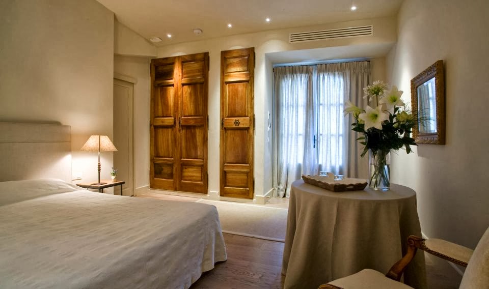
The linens look so crisp. 


More accouterments for the lucky guest.
 
Although my guest room is not as well-appointed as Roehm's, I do have a bottle of French orange blossom water (for cooking--I'm not sure why) so I'm going to sprinkle the scented water on the pillow cases while ironing them.  At least it will make the chore enjoyable. 
 
Carolyne Roehm also has a beautiful website (new?), which you can find here for more gorgeous photos and inspiration.  It also includes new photos related to the original Veranda guest room article she wrote.  
 
Happy Weekend, a little early


All images from Veranda magazine.  First photo by Sylvie Becquet.  All other photos by Carolyne Roehm.


My Favorite Kitchens

Here's a brief tour of my favorite kitchens from Pinterest.  White cabinets rule these days, don't they?
 
Source
This is my favorite of the group.  Creamy cabinets, white marble counter tops and a gray stone (limestone, bluestone, Belgian stone?) counter top on a dark gray island.  Plus, that's a Lacanche stove back there.  Isn't she a beauty?


Darryl Carter
You already know how I feel about Darryl Carter.  He can do no wrong in my book. 

Darryl Carter
Well, actually, as much as I admire Darryl Carter's taste, I would replace these stools.  They look good because they echo the color of the beams, but they don't look comfortable do they? 


David Kleinberg via Veranda
A crisp white kitchen with black accents.  Pretty ceiling detail too. 
 

J. Randall Powers via Elle Decor
Such interesting chairs and stools.  I like these very much. Creamy white cabinets again.  


Source Unknown
My guess is that these are honed black granite, slate, or engineered stone counter tops.  Sorry, not much of a guess is it?  I wish I knew the source of this kitchen.   


Khachi Design Group
 An interesting note about this counter top.  Apparently it's not marble, but Cambria Quartz in "Torquay".  It looks like a good alternative to marble.


Source Unknown

And just for fun, I consider this to be the little black dress of kitchens.

Happy Weekend