
Does this look familiar?

During a recent web browsing session, I came across these photos of Dallas designer Shannon Bowers's beautiful home on Sotheby's website. The interiors, furnished with French and Swedish antiques, will be instantly recognizable to Veranda magazine readers since the home was featured in the September 2008 issue of Veranda. I remember marveling over these interiors when my issue arrived that month. Antiques, soft colors, and abundant sunshine filled every room. And now, to see even more photos of the home on Sotheby's website is a bonus. This naturally lead me to compare the rooms from Sotheby's website to the Veranda photos (all Veranda photos by Peter Vitale).

But first, here is the exterior of the house. It's just as beautiful and well manicured as one would expect for this home. Neatly trimmed boxwood hedges and topiary (at least it appears to be boxwood) frame the entrance.

Here is the front entry from Sotheby's website. The soft colors of the rug complement the pale floors and white walls. A few key antiques are allowed to shine. Compare this to the photo below from Veranda, which presents the room from a different angle.

Moving on to the living room, below, this photo is a wide angle shot from Sotheby's website.

Moving on to the living room, below, this photo is a wide angle shot from Sotheby's website.

Ah, so this is the entire room, above (from Sotheby's), instead of the small portion of the room Veranda showed, below. I was curious to know the context of the trumeau and daybed in the Veranda photo. Where in the house was the photo taken? And now we know--it's part of a larger living room. Of course, the difference in views is not surprising as we all know that the photos for a real estate listing should help the viewer see as many rooms as possible and the purpose of the magazine spread is to highlight the designer's work.

And here, below, is Sotheby's photo of the other half of the room.

A few of the chairs in the Veranda photo are different from those in Sotheby's photo and the Veranda shot includes a cream-colored rug, which doesn't appear in Sotheby's photo. Also, the table in front of the sofa is different in each photo and the pillows on the sofa in the Veranda photo are Fortuny. The pillows appear to be linen in Sotheby's photo.

This is my favorite photo, which is the dining room with a view into the kitchen. What a beautiful room in which to have dinner after a long day at the office (I digress...). The blue and green painted doors are fully visible and at the center of the room is a worn, light colored, painted table. Compare this to the Veranda photo below.

The dining chair seats are covered in pale blue linen in Veranda's photo. The table is smaller and a dark color. Also, there is a bench in Veranda's photo which does not appear in Sotheby's photo. I think I prefer the room with the cream colored seats on the chairs and the larger white dining table.

And here, below, is Sotheby's photo of the other half of the room.

And compare that to the photo below that appeared in Veranda.


A few of the chairs in the Veranda photo are different from those in Sotheby's photo and the Veranda shot includes a cream-colored rug, which doesn't appear in Sotheby's photo. Also, the table in front of the sofa is different in each photo and the pillows on the sofa in the Veranda photo are Fortuny. The pillows appear to be linen in Sotheby's photo.

This is my favorite photo, which is the dining room with a view into the kitchen. What a beautiful room in which to have dinner after a long day at the office (I digress...). The blue and green painted doors are fully visible and at the center of the room is a worn, light colored, painted table. Compare this to the Veranda photo below.

The dining chair seats are covered in pale blue linen in Veranda's photo. The table is smaller and a dark color. Also, there is a bench in Veranda's photo which does not appear in Sotheby's photo. I think I prefer the room with the cream colored seats on the chairs and the larger white dining table.

Above is another living room / seating area in the home from Sotheby's. Compare this to the photo from Veranda below. Again, there are some subtle differences in the home. The rug is gone and a dark bench replaces the light bench that was in Veranda's photo. The art is different as well in Sotheby's photo.

The photo below of a library/office did not appear in the magazine. It's a nice sized room with plenty of shelves and storage space. It's sparsely furnished, but the dark stained table is highlighted by all the white wood work. The pale, bleached floors are beautiful and remind me of beach sand. They give the rooms a calm and serene look. The same look can be achieved by using sisal, wool, or sea grass rugs (but sisal and wool are more susceptible to stains).

The children's playroom, below, as shown on Sotheby's website. I like the wood shelving unit and baskets. There's plenty of room for storing toys, books, and games.

And here is how the same room appeared in Veranda, below.

And the pretty bedroom for a little girl, behind the french doors off the playroom, is shown below, from Sotheby's website. This room appears to be the same as it was in Veranda, except that the colors are not as vibrant in this photo and the lavender rug is gone.

The bedroom below did not appear in the magazine, at least not decorated like this. It looks like it could be a guest room and there's a view out the window to the garden.

But Veranda also included a baby boy's room, below. I wonder if the room above is the same room, redecorated for an older child?

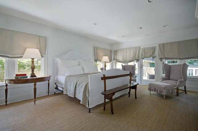
The master bedroom, below, is dressed in neutral linen punctuated with touches of lavender, as it appeared in Veranda.

The furnishings in the master bedroom, below, on Sotheby's site are pared down. Roman shades are used on the windows here, where most of the other rooms have wood shutters on the windows.
It's surprising that Sotheby's photos do not include the kitchen, shown below in Veranda. I wonder what their rationale was for not including it on the website.

There is also an outdoor deck with a dining area and separate seating area. The furnishings look just as expected, based on the interior of the home.

The listing also mentions separate guest quarters on the property, below. It's a charming house in its own right.

Here's a view of the interior of the guest house, including a lovely bedroom with two twin beds and a bathroom. Who wouldn't like to stay here for a few nights?

This is such a beautifully furnished home that it's difficult to imagine what it looks like empty. It's clearly a spacious property that's well cared and I would think it will (or did?) sell quickly. The difference in real estate prices across the country continues to amaze me. The listing price of this home would be twice as much in the Boston area.
To learn more about the home, click the Sotheby's link in the first paragraph above and to see the Veranda article, click the link to the magazine in the same paragraph.
Such a beautiful home! Love the serenity of the home.
ReplyDeleteHave a wonderful weekend.
Teresa
xoxo
What a fabulous post Deborah, you’ve turned into quite the real estate sleuth. Love the furnishings in this home although they seem a bit at odds with the more modern/sleek house, yes??? The rooms themselves almost seem to perfect with the furniture, maybe it's just me. I really loved seeing the difference in the photos, great seeing the whole rooms. Good job girlfriend!
ReplyDeleteIt is always so fun to see a home from a different view. Thank you for sharing!
ReplyDeleteI remember this article in Veranda very well. It was onw of my all time favorites. Thanks for sharing the additional photos.
ReplyDeleteGreat post! Really loving the contrast of the Veranda shoot to the realtor photos. I prefer the Veranda take....
ReplyDeleteIf I was to purchase the home, I would want all the furniture. It's perfection.
WOW - my favorite kind of post, featuring a home that has been in a magazine and is now listed for sale. I like that this home is not 'overdone' - it is simply but beautifully furnished.
ReplyDeletePS - I love the background color of your blog - such a beautiful shade that translates as greenish gray on my monitor.
I am posting this on my facebook page for my readers to see!
This is why I read blogs - love your side-by-side comparison and the extra rooms that weren't in Veranda.
ReplyDeleteLoved this. I have looked at the Veranda images several times. I love Shannon's work and her Mother's (Pamela Pierce) as well. I found my first blog a few years ago by googling Pamela Pierce to see more of her work. You can guess it lead me to Cote de Texas and I was hooked on blogs from that point on. As much as I love this and every piece of furniture in it, I have to admit it looks like no one lives there. It's very beautiful but not completely inviting. Maybe a tad too sparse, I don't know. Thanks for doing the wonderful comparison. Have a great weekend. Mona
ReplyDeleteDeborah, such a gorgeous home. The difference in the photgraphy is very interesting!
ReplyDeletexoxo
Karena
Art by Karena
Beautiful home and I too love the comparison and extra look.
ReplyDeleteI loved scrolling through and reading this post. This house is gorgeous. It was fun to spot the differences.
ReplyDeleteAngex
hi Deborah, ye i could relax in there ! love the Swedish antiques too thankyou fayx
ReplyDeleteOne word, Beautiful!
ReplyDeleteI would be happy with the smaller house.
~Sharon~
Just love this house. Thanks for the update and good research.
ReplyDeleteFresh for January.
That was so much FUN! My first thought, seeing the second photo, was that the boxwood planters grabbed your interest right away!
ReplyDeleteI love comparing the photos. The real estate ones appear to have all the lights on and more neutral colors.
Mary Ann
OMgoodness! I totally love it especially with the touches of blue. It seems so peaceful. Many thanks for the story. Fiona
ReplyDeleteBeautiful post! The house is perfect. I'll take it! I love all the light and airy Veranda photos...
ReplyDeletexo Terri
the house is sale pending. i am shocked at the price - it's cheap no matter where it is, but really cheap. it must be becuse there doesn't appear to be any back yard? i think the bedroom is an add on and that is why there is no back yard - but i could be wrong about it. the house is utterly gorgeous. just gorgeous. the furnishings are incredible. but what do you expect from shannon? just beautiful. great article!!!!!!!!!!!!!!!!!!!!!1
ReplyDeleteEnjoyable to look at... way too plain for me- I do like Banjo clocks and some of the punches of color that were there. The exterior manicured shrubs look so perfect..just amazing. I know how hard that is to accomplish!
ReplyDeleteI'm an interior designer from Melbourne, Australia - I loved your blog, I found it very inspiring. This is all new to me but I have just set up my own blog
ReplyDeletescrapbook-melissah.blogspot.com
You may like to check it out because I had so much fun doing it.
Thanks for providing me with such great entertainment!
Cheers
Melissah
Hi there, I oohed and ahhed over this house in Verandah and did a post on it on my blog a little while ago. It actually looks even better in the real estate photos because it's mor real and you can imagine actually being in those spaces. I envy the lucky buyer- though they wouldn't have all that gorgeous furniture! Love you to visit my blog sometime, and love your style! Many thanks,
ReplyDeleteNaomi
livebreathedecor.com
I'm shocked at the price as well! I live in Oklahoma, and I'm very familiar with Dallas. The location is excellent it looks to be in the Turtle Creek area which is south of the exclusive Highland Park. Great post!
ReplyDeleteI have loved this house for so long! Just beautiful!! You are right about the price vs. Boston - oh to be able to relocate!! Great sleuthing Deborah!! Loved this!!!
ReplyDeleteHappy New Year!!
xx-Gina
Thank you for sharing this house. I still love it...wonder if they sold it furnished?
ReplyDeletexo kelley
I totally want the guest house! Wondering if the reason Sotheby's didn't show the kitchen is because it isn't the usual stainless/granite that they seem to think buyers want? Plus no upper cabinets. Just a thought...
ReplyDeleteGreat post! I'm so glad I stumbled across your blog. Over Christmas my little sister found the real estate listing for this house and my mom and I spent hours drooling over the house. Then everybody hopped in the car and did a drive-by ... ok a couple drive-bys. I think the reason it is seemingly listed so low is because it is just outside boundary of Highland Park and thus does not have access to the school district or the HP police and fire department. It's actually in a very nice area though.
ReplyDeleteI love this..! Where is that house located in Dallas? I live close to Ft. Worth..
ReplyDeleteLovely post as usual. I really like the outside of the house and it has good bones. However, the house lacks warmth and as Mona said, a bit too sparsely decorated. Perhaps it has been over edited for the photos.
ReplyDeleteVery pretty home, but not as beautiful as your siamese cat. Home is where your cat is!
ReplyDeleteDelightful so see such beautifully made slipcovers. All the soft coverings and pillows are exceptional!
ReplyDeleteI have the kitchen saved in my kitchen inspiration file. Such a beautiful home. I feel more relaxed just looking at the pictures! Thank you for the lovely escape.
ReplyDeletexo
Brooke
That is a very nice blog.it really prove helpful for my Business.
ReplyDeleteRegards
The Fountainhead Fort Lauderdale