Simple

Simple

A Nantucket Cottage Before and After

It was 92 degrees today in Boston and the start of Memorial Day weekend is only hours away. Summer is here along warm breezes, sunny skies, open windows and weekend trips so it's a great time to think about summer cottage decorating. Unfortunately, I don't own a summer place, but I recently found photos of designer Jeffrey Bilhuber's summer cottage on Nantucket. These before and after photos of the cottage are from the September 2003 issue of Architectural Digest and show his unique take on the cottage look. The living room (shown here) is crisp and tailored with classic upholstered furniture, but also light and airy thanks to the open beamed ceiling and white sheers on the windows. The tangerine accent color on the chairs and pillows is a refreshing change from the blues typically used in summer homes near the beach.

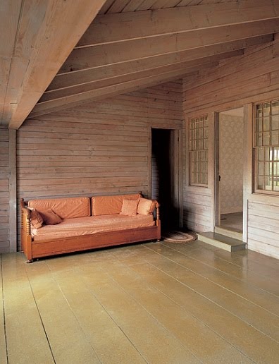
Above is the same room before Bilhuber's transformation. To say that this designer has great taste and skill is almost an understatement.


Here's a before shot of what appears to be a den.

And the after. Chocolate brown walls warm (or cool) the space.
The dining area before with its gray stained walls.


Bilhuber kept the gray colored walls and added more tangerine colored accents. My favorite elements are the white contemporary dining table paired with traditional style chairs.

Here's another view into the den from the dining area.

And of course, the house only gets better. Here's a before shot of a room....

...that was transformed into a master bedroom. The matching chests must provide ample storage in this house where closet space is likely scarce.

A bright bedroom gets even better....

...with the removal of dated carpeting and wallpaper and the addition of original art plus sheer cafe curtains.


The house looks so tiny from the exterior, which is typical of the original cottages on Nantucket. No one would know from passing by what a fresh and inventive interior awaits inside. It's the perfect weekend retreat, if you ask me.


Have a Great Memorial Day Weekend!


All Photos by Peter Vanderwarker for Architectural Digest

Trunk Show


I am not a designer logo handbag kind of girl, although I would not turn down a small black quilted Chanel handbag (you know, the classic bag with the gold chain strap), but it's just not my look. Don't get me wrong. I like nice things including handbags that are stylish and well made. It's just that my lifestyle and budget at the moment don't support anything with a logo other than a Lacoste polo shirt.


So, why I woke up this morning thinking to myself "wouldn't the living room look great with a vintage Louis Vuitton trunk for a coffee table?" is still a mystery to me. Sure, the trunk would be eye catching, but also prohibitively expensive. It occurred to me in a brief (thank goodness) flash that the LV could be "fauxed" onto a trunk to look like the real thing, but as with fake designer handbags, it's better to own something affordable and authentic rather than a cheap copy of a luxury item.


From there, I made my way to Google (sounds familiar, yes?) where I found these images of Louis Vuitton trunks used for tables. They've probably been drifting around the interior decorating blog world for a long time, but they're new to me and hopefully you as well.


Photo sources from top: blossominteriors.com; Home of Ken Fulk, House Beautiful Magazine, photo by Victoria Pearson; HGTV.com; maisonclassique.com


To Paint or Not to Paint

Miki Duisterhof, Country Living

It seems lately that wherever I look there are images of homes with creamy white painted walls. There's a whole world out there of white walls that are not overly bright, sterile or bland. If my walls were just the perfect shade of white, I would finally be satisfied with my house. And I long to have this perfect white on my walls. Now. But, there's really nothing wrong with the wall color. It's a quiet neutral taupe that works just fine with everything in the house.


via the blog Belgian Pearls


Yet, I want to paint. But, I'm trying to talk myself out of it. And with good reason too as summer is approaching and why should I be stuck in the house prepping and painting when there are beaches to walk, antique stores to shop, and tennis to play.

Charles Spada Interiors / This Old House
So, to get beyond my infatuation with white walls I looked through my favorite of images that feature warm, taupe colored walls.

Laura Bohn
I see my home in a new way now and focus less on the wall color.
Eric Prokesh, Southern Accents
And more on the furnishings, lighting and accessories in the room.

Amelia Handegan, Southern Accents

This little exercise has convinced me not to repaint the entire house or even part of the house white.
Charles Spada Interiors / This Old House
It's lead me to realize that what my house needs is not a new paint color, but more oomph. Pizazz. A hint of color. Contrast. Texture. Interest.

My Living Room
All on a tight budget, naturally. But, I'll get there eventually.

Happy Weekend

Hotel Verhaegen, Zoom Interiors

It's raining here today, but it's a good day to get some things done. I've been behind in my posting and hope to catch up this weekend.

Have a great weekend, everyone and Happy Mothers Day to all Moms!

Light and Dark

Architectural Digest

I'm just back from visiting my parents in Florida and did not have a chance to keep up with my daily perusal of the New York Times. So, on the bus to work today I read this article in the Times from last week about Duane Hampton, wife of the late interior decorator Mark Hampton. Mrs. Hampton is quite a lady and it seems she and her husband had quite a life together.

This is the living room of the Hampton's Southampton home from 1996. According to the AD article, Hampton painted the walls dark brown because "dark walls are warm in winter and cool in summer." Oh, of course. Perfectly logical. He makes it sound so simple. Yet, perhaps there should be a caption for us average folk...don't try this at home. I wish I'd had the foresight (not to mention the nerve) to try this, including the jumble of different style chairs. The room looks so undecorated and unplanned. Was that the point? I am curious about what Hampton's process was for creating this room, if there was one. Maybe I'm over planning and over analyzing when it come to "decorating" my own home. Could it really be so simple? Naturally, I'll spend some time pondering this theory. On the bus.


Shells, Part II


You may remember the Shells, Part I post from a few weeks ago where I was looking for inspiring ways to display my shell collection in a non-beachy way. I asked readers to leave comments with suggestions and not only did some great ideas come my way, but also photos too. The above photo was sent to me by reader and interior designer, Sue Murphy (www.suemurphydesigns.com). This is a display Sue created for a client and the image really knocked my socks off. It's a brilliant idea to pile large shells in an antiqued wire urn. The urn has a classic shape, gives some height to the arrangement and lets one see the color and texture of each shell. This is gorgeous and definitely a departure from the beachy look.

Here's another photo from Sue Murphy of the same home and it also has a decidedly French feel. Shells are piled high into a silver bowl on a silver tray, surrounded by old books and candles. A huge French trumeau reflects the vignette and tops an elaborately carved console. I love everything about this image and the soft coral colored accent wall and iron lantern contribute to the vintage French feel.
A close-up of the photo above. If this is a small area of the house, the rest of the home is sure to be just as beautiful and detailed. Maybe Sue will fill us in (hint, hint)!

This image is stored in my "The One That Got Away" file. A pretty silver tray like this that I saw on ebay would be an elegant way to display a collection of shells, don't you think?
Sue also shared this photo of shells in a concrete urn from her own kitchen. Such a classic look!

Here's a more holiday type of display for shells, but this could work year round too. A French gilt console with a black lacquered top holds topiary, lamps and shells in glass vessels. This is the home of Luce Gayrard and was featured in the November 2008 issue of Canadian House and Home (photo by Angus McRitchie).

A close-up of the above image. The glass urn in the background is so versatile for displaying shells, flowers or Christmas ornaments. Again, I like how the individual shells can be seen through the glass and the black accents of the console and lamp shades really set off the pale colors of the shells. Beautiful.

When looking for over-the-top elegant inspiration, I always turn to Veranda Magazine. There's a lot to see in this photo of Kay O'Toole's former home in the April 2007 issue. But, my point is that although most of the elements in this room may be unattainable for most of us--the antique chairs and French Aubusson rug, among other things--anyone can find an old metal urn and fill it with shells for a pretty display. I plan to try this for my dining table this summer and put flowers elsewhere in the room for a change of pace.
Lastly, here's a photo of a table in my home with coral and a small sample of my shell collection.
I hope you enjoyed this post about displaying shells and please let me know if you have any other ideas or images to share.
Happy Shelling!