Simple

Simple

Timeless


A funny thing happened the other day when I read Linda Merrill's blog Surroundings and the post she did here on the Nantucket Home of interior designers Lee Bierly and Christopher Drake featured in New England Home Magazine. I  bought the issue for a closer look at their beautiful home and while thumbing through it, discovered a Connecticut home that Charles Spada had designed twenty years ago, but that he'd recently "refreshed" for the clients. My Charles Spada folder is well stocked with photos of his work and I immediately recognized this bedroom from several years ago...


And here it is in an earlier photo from hgtv's website. The quality of the New England Home photo is much better than hgtv's and the room looks warmer now with a new rug and bed linens including a taupe coverlet. My bedroom needs some sprucing up and the refreshed bedroom has a look I'd like to match--classic style with French flair that will never go out of style.
Top Photo: "New England Home Magazine", July/August 2010 issue. Title of article "Refresher Course". Photo by Bruce Buck. Interior Design & Architecture by Charles Spada. Article text by Stacy Kunstel. Visit the New England Home website for more photos of this home and the article here.

Bottom Photo: hgtv.com. Interior Design & Architecture by Charles Spada. Photographer and writer unknown.

Lovely to look at, delightful to hold...

I received an email update this week from Skinner, Inc. about their upcoming July 10th auction of European Furniture & Decorative Arts. The auction will feature the Wedgwood collection of Joe Skirchak and Pat Cerra. Apparently, Skirchak and Cerra have collected Wedgwood for 30 years and have been dealing in Wedgwood since 1984. According to Skinner's website, the collection "encompasses the full breadth of Wedgwood’s manufacture, the collection numbers approximately 350 lots and includes many fine examples". Here are a few pieces that caught my eye. These items have estimated auction prices of less than $800, but I suspect that the sales prices will far exceed some of the estimates.
Here is the classic Wedgwood Creamware that many of us love so much. These are four 19th Century pieces from England.
I've seen plenty of Cream Ware fruit baskets around, but have never seen any with chocolate brown enamel like this Queen's Ware late 18th century English basket with underplate.


I usually prefer the all white Cream Ware, but this set of Queen's Ware "Mared Pattern Items" from England, late 18th Century each with a blue feather edge and onion border is just beautiful.

This is an 1882 calendar tile with "Bonner's Map of Boston" printed on the reverse. I would love to hang this on my kitchen wall.

A Diceware "coffee can and saucer" with three-color Jasper dip, England mid-19th Century with "green ground with yellow quatrefoils between white foliate banding". Can you imagine sipping your morning coffee from this cup?

I'm drawn to the Wedgwood Terra-Cotta pieces too like this classical English cooler circa 1865.

This English food warmer set from about 1800 looks to be in fine condition.

Above is a Diceware teapot, sadly with broken handle and a Queen's Ware monteith with foliate handles and blue enamel trim. I'm not sure what one does with a monteith (even after a quick Google search), but I'd fill this with soft pink colored peonies and set it on my dining table.

Charming rabbits on "Daisy Makeig Jones Designed items", English 1923.
And lastly, I've never anything like this before. So unusual (to my untrained eye) and elegant. This is a boxed set of George III Silver and Wedgwood Blue-Japser Handled flatware. I'm sure these require hand washing only.

All photos and information from Skinner, Inc. Click to visit the website and register to be notified of upcoming auctions. This is not an advertisement and I'm not affiliated with Skinner, Inc. (although I'm not opposed to the idea). I just like nice things.

Ode to a Dining Room

Image via Antique Shops and Designers Magazine, Volume I. Designer, J. Randall Powers
Photographer, Unknown

Caramel, butterscotch, and gilded arms
Oh, how your parchment painted walls hold such charm
Touches of gold punctuated with green
Old and new together, a lovely scene
No Crate & Barrel nor Pottery Barn, hmmm gosh darn
It's all beyond my budget
But thanks for reading this bit of a yarn


No, it's not bad poetry week in Boston. I'm just fresh out of creative ways to express my admiration for beautiful rooms and the talented designers that create them. Hopefully, you're laughing with me and not at me. And, to view more work of J. Randall Powers, visit his website.

Post-Haste: Boxwood Hedge

Image via Domino Magazine. Designer, Stephen Shubel

When I first saw this photo, I had no idea that this boxwood hedge is actually artificial boxwood. I think it looks great and wouldn't hesitate to use in it in a small space such as a concrete patio or a rooftop deck (properly secured!). In this case, the hedge hides an ugly chain link fence. What do you think? Is artificial greenery the way to go if you can't have a garden or is it best to forgo if you can't have the real thing?

Boston Design - F.D. Hodge Interiors

Some of you may remember my post about the work of Seattle area artist Victoria Adams. Soon after that post, Boston interior designer Frank Hodge contacted me about Victoria's paintings. He'd found my post after searching the Internet for Victoria's work and was interested in her paintings for the same reasons I was, but was also looking for art for a client. Frank's email about my blog was very kind and encouraging and we exchanged a few emails they way we all do when we make a connection over the shared interest of interior design. I visited Frank's website and was immediately impressed by his work and if you visit his site, you'll understand why. I was so pleased that Frank agreed to let me post photos of his work that I could share with you here. The images to the left and below are of a sun room he designed for his client in Rye, NH. This home is a work in progress and I hope Frank will have more photos to share as the work continues. It looks like a beautiful home!

Frank is one of those fortunate people who has a focused eye and a great sense for color. He is mostly a self-taught designer, having attended classes at the Boston Architectural Center and having worked for Judy Ross & Co., and as a consultant to Charles Spada (another of my favorite Boston designers) before striking out on his own in 2006. His website features some of his projects, including show houses for the Museums of Old York in Maine. Frank got his start in the business after renovating a farm house he purchased in Chester, Connecticut. Word soon spread about how beautiful his house was and the editor in chief at the time of Woman's Day magazine, Jane Chestnutt, asked to see his home. She was looking for a designer to redo her apartment in New York and hired Frank for the job. Quite a start, no? Take a look at some of Frank's projects below.
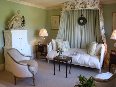
"Marjorie's Room"
This is the guest bedroom Frank designed for the 2008 Museums of Old York Show House. The pistachio green walls were a surprise to me, but aren't' they unique and refreshing? Oh, how I love this room. I almost don't want to show the before photos, but you have to see the transformation to fully appreciate this room......

Below is the wall on which the bed and canopy were centered:
Following are before and after photos of Frank's work in the kitchen of the same show house. Most of the original cabinets remained and it's a great example of what a little ingenuity and creativity can do without completely gutting a kitchen. After. Cabinet doors removed and filled with Paris porcelain and silver: Sink area before: And after: Before the installation of a new green cupboard: And after:
Another view of the sitting area in the finished kitchen:

Moving right along, here are photos of rooms Frank designed for the 2008 Museums of Old York Show House. This is the "after" of the Master Bedroom. Neutral tones make this room a calming retreat: Fireplace before:

After. A reproduction unfinished George Washington portrait and iron lantern are unexpected touches in a bedroom. The floral pillow on the love seat adds a hint of color to the room.
Plenty of natural light....

...makes a great spot for a bookcase and antique writing desk:

I could move right in! If you'd like to see more of Frank's work and press coverage, visit his website here (F.D. Hodge Interiors).

Frank will also be designing a living room for the 2010 Museums of Old York Show House in York, Maine, if you'd like to see his work in-person. I've marked the date my calendar and won't miss it! The show house will be open to the public from July 17 through August 14 and you can find more details including directions here.

A Nantucket Cottage Before and After

It was 92 degrees today in Boston and the start of Memorial Day weekend is only hours away. Summer is here along warm breezes, sunny skies, open windows and weekend trips so it's a great time to think about summer cottage decorating. Unfortunately, I don't own a summer place, but I recently found photos of designer Jeffrey Bilhuber's summer cottage on Nantucket. These before and after photos of the cottage are from the September 2003 issue of Architectural Digest and show his unique take on the cottage look. The living room (shown here) is crisp and tailored with classic upholstered furniture, but also light and airy thanks to the open beamed ceiling and white sheers on the windows. The tangerine accent color on the chairs and pillows is a refreshing change from the blues typically used in summer homes near the beach.

Above is the same room before Bilhuber's transformation. To say that this designer has great taste and skill is almost an understatement.


Here's a before shot of what appears to be a den.

And the after. Chocolate brown walls warm (or cool) the space.

The dining area before with its gray stained walls.


Bilhuber kept the gray colored walls and added more tangerine colored accents. My favorite elements are the white contemporary dining table paired with traditional style chairs.

Here's another view into the den from the dining area.

And of course, the house only gets better. Here's a before shot of a room....

...that was transformed into a master bedroom. The matching chests must provide ample storage in this house where closet space is likely scarce.

A bright bedroom gets even better....

...with the removal of dated carpeting and wallpaper and the addition of original art plus sheer cafe curtains.


The house looks so tiny from the exterior, which is typical of the original cottages on Nantucket. No one would know from passing by what a fresh and inventive interior awaits inside. It's the perfect weekend retreat, if you ask me.


Have a Great Memorial Day Weekend!


All Photos by Peter Vanderwarker for Architectural Digest